Productdesign

 abstract landscapes
The design was about content and colors that do not trigger any association with a particular gender. Landscapes are a safe theme here. The colors are kept in green, blue and brown tones and thus also remain free of prejudice. From this color selection and abstracted landscape scenes, a variety of designs could be created.
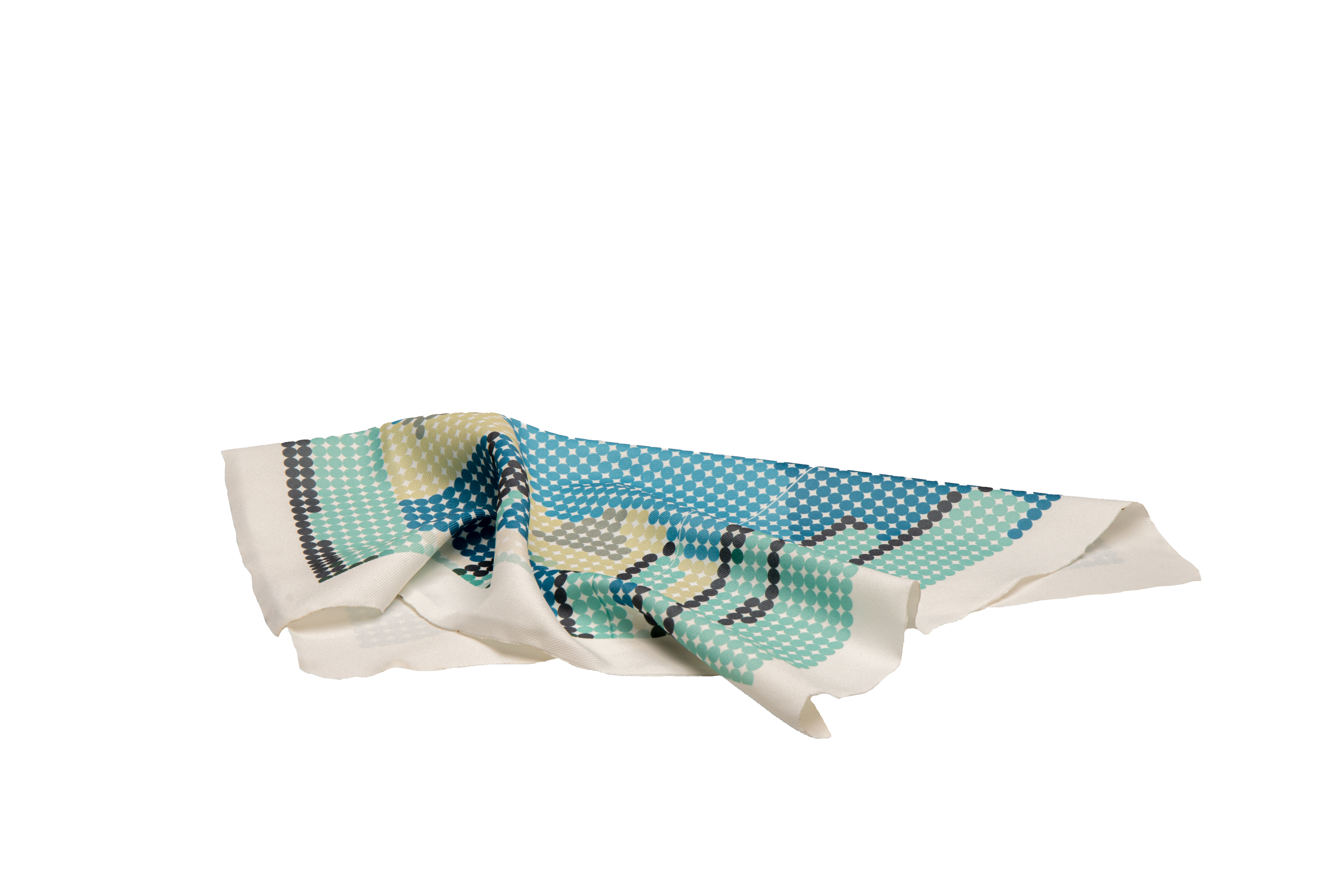

The finished designs were then transferred to Grasshopper and further abstracted. The result was graphics consisting of circles, which contain the original colors.
This style will give a high quality feel on the finished cloth and is reminiscent of existing trends from the 70s. The further abstraction additionally moves the product away from the gender division.
This style will give a high quality feel on the finished cloth and is reminiscent of existing trends from the 70s. The further abstraction additionally moves the product away from the gender division.
For a more coherent overall impression created a logo and packaging in the form of a strip that holds the cloth together. It is adapted to the individual designs and shows the name and size.
The name comes from the spanish word "todo" which means "all". It is meant to represent the possibilities of use as well as the diversity of those who use it. In the logo you can also see the points of the cloths.
The name comes from the spanish word "todo" which means "all". It is meant to represent the possibilities of use as well as the diversity of those who use it. In the logo you can also see the points of the cloths.
