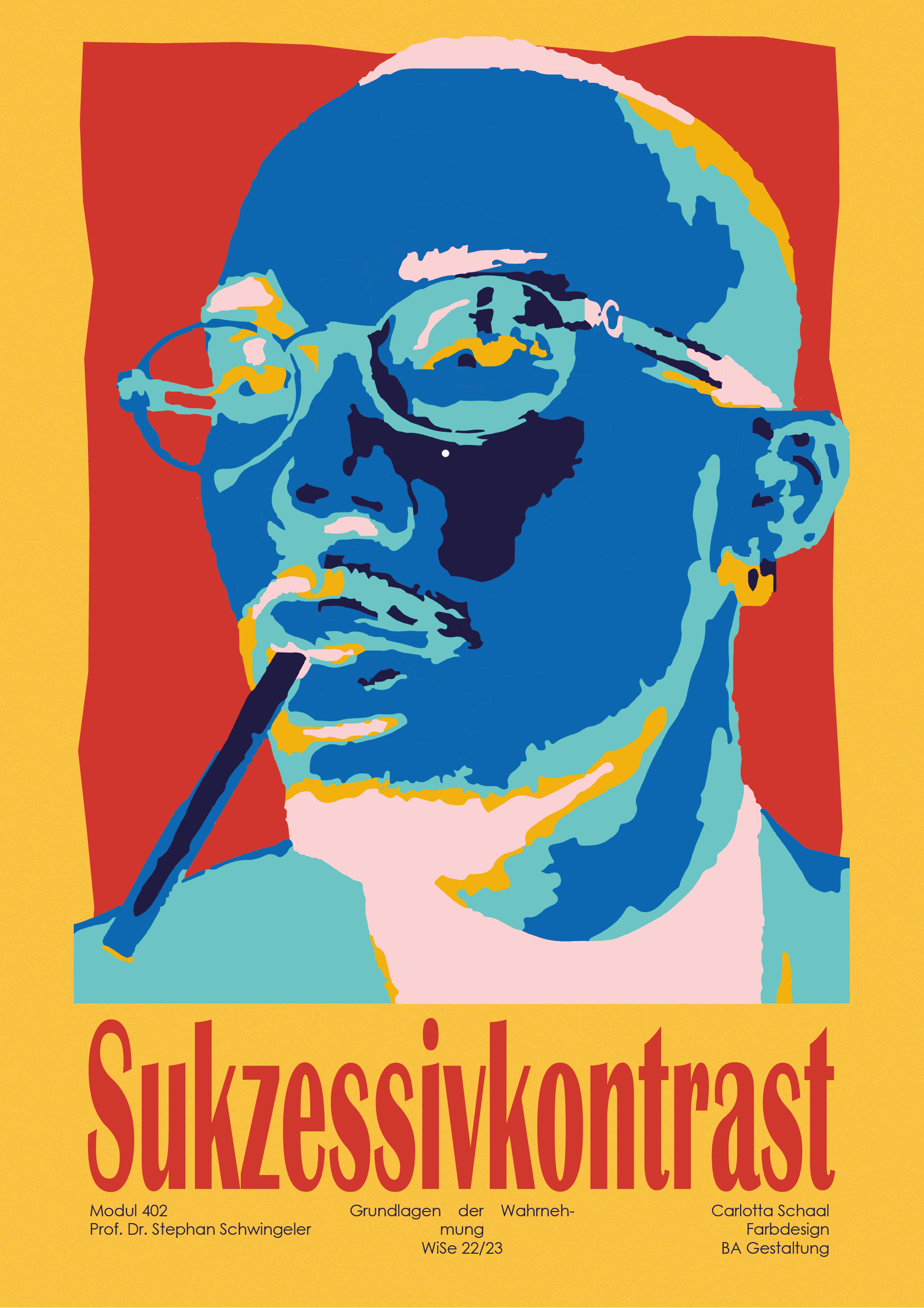
Playing with perception
successive contrast
Gegensätzen Konstant und Inkonstant und be

The design process begins with a clear idea
of what you want to express and make the viewer feel. The design
should not be just an aesthetic element, but can serve to make us question
to question what surrounds us. This design should make us question our
our perception of color and what we really perceive when we interact with graphic
we interact with graphic elements. The
Successive contrast is based on contrasting colors and brightness. It is created by
the effect of colors and their contrasts.
The successive contrast
is a physiological phenomenon in which, after viewing a color for about
for about 30 seconds, a virtual afterimage of the complementary color is created.
This poster allows the user to interact with the
space by viewing it and diverting his or her gaze to experience the effect. It
creates an experience that goes beyond the boundaries of pure design. The
vision is maintained as the primary sense, but other senses such as the movement of the
of the body are included.
Poster 1

Poster 2
mockup
